

Device controls
Change inverter and battery settings safely from the Controls page.
Cards and the showcase
Every card type, what it needs, and how to try them with made-up readings.
Install as an app
Put Epilykos on your phone or computer like an app, and let it switch between home and away addresses.
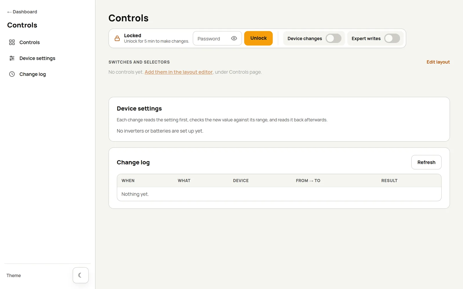
The Controls page, at /controls, is where you change inverter and battery settings, and where the
switch, selector, slider and knob cards live. You need to be signed in to use it.
How it keeps you safe
Changing an inverter's settings can affect your whole power system, so the Controls page is careful:
- Device changes starts switched off. While it's off, nothing on this page or on any dashboard can change a setting on your inverter or battery.
- Even when it's on, you have to enter your password again to Unlock the page. The unlock lasts 5 minutes, and ends early when you sign out or press Lock now.
- Before changing anything, Epilykos reads the current value. It refuses the change if the new value is outside the setting's allowed range or step, if the device reports a current value that's out of range (a sign that the register might mean something different on your model), or if the value has changed since the page last showed it.
- After writing, Epilykos reads the setting back and tells you if it doesn't match what you asked for.
- Every attempt, including the refused ones, is recorded in the Change log.
A changed setting changes how your inverter or battery behaves. Check each value against your device's manual, and change one thing at a time.
Device settings
These devices can have settings changed so far:
| Device | What you can change |
|---|---|
| LuxPower (dongle, over Wi-Fi or Bluetooth) | Battery charge limits; charging, discharging and grid charging current and power limits; export to the grid and its limit; the grid charging rule and windows; charge first and forced discharge with their limits and windows; output priority, AC input mode, eco and green mode, charge last, fast zero export and the buzzer |
| JBD and JK Bluetooth BMS | Charging and discharging on or off |
| Phocos Any-Grid (over Bluetooth) | A set of settings known to be safe, on the 3, 5, 6.5 and 8 kW models |
A couple of notes:
- LuxPower: the charging and discharging power limits, the grid charging power limit, the grid charging, charge-first and forced-discharge switches and the grid-charging windows come from the LuxCloud app and only work when the inverter reports a GETA model. The other settings follow the LuxPower protocol, so the LuxPowerTek Generic Hybrid profile offers them on any LuxPower inverter; the LuxPowerTek GETA 3.6kW 24V profile offers the ones that model has. The inverter's firmware may still refuse or limit a value. Download verification saves a read-only snapshot of the inverter's settings, which is handy to keep before and after a change.
- JBD and JK: switching discharging off cuts power to whatever the pack supplies, so the page asks you to confirm that separately. If a pack won't switch charging back on, it's usually protecting itself.
Expert register writes
Expert writes (off by default) let you read and write any register number, for registers you've
checked in your device's manual. Register numbers can be decimal or hex (0x…), and values are whole
numbers from 0 to 65535 in the register's raw units, with no scaling. The same unlock and change log
apply.
Control cards
To add control cards, open the layout editor, choose Controls page from the dashboard menu, and add a Toggle switch, Button, State select, Slider or Rotary knob. They appear on the Controls page under Switches and selectors.
What a card can control
A card can control a Tuya value, a Home Assistant entity, an MQTT topic, or an inverter or battery setting from the list under Device settings. Device settings appear in the card's picker under Inverter and battery, followed by the device's name, and each card offers only the settings that suit it:
| Card | Inverter and battery settings it offers |
|---|---|
| Toggle switch | Settings that are on or off, such as grid charging, charge first and forced discharge on a LuxPower, or charging and discharging on a JBD or JK battery |
| State select | Settings with a list of choices, such as output priority. The choices are filled in for you |
| Slider and Rotary knob | Settings that are a number, such as a charging power limit. The lowest value, highest value, step and unit are filled in for you |
Times of day (such as the grid charging windows) have no card, and the Button card doesn't offer device settings. Like every control card, these only work on the Controls page; on a dashboard they show a link to it.
A card for a device setting reads the setting from the device when the page opens, once a minute while the page stays open, and after each change. It isn't shown from the dashboard's regular readings, so what it shows is what the device reports. Changing it follows the same checks as the list on this page:
- the current value is read first, and the change is refused if it no longer matches what the card showed (the card then shows what it is now);
- the value is read back afterwards, and every attempt goes in the Change log;
- if the device can't change that setting (for example, a setting for a model yours isn't), the card is locked and says why. If the device doesn't answer, the card shows as unavailable.
A card sends one request to the device each time it reads, so a page with many device cards makes the dongle busy; a few cards that you really use work better than a card for every setting.
Sliders and knobs
The slider and the knob set a number: a Home Assistant number or input_number, a Tuya
value, an MQTT topic, or a device setting. Pick what you want to control and give it a lowest value,
highest value and step (a Home Assistant number or a device setting fills these in for you). Moving the control only previews the value; it's
sent when you let go of the slider, or stop turning the knob or pressing keys, so each gesture is one
entry in the change log. Tapping the knob changes nothing, and the arrow keys, Page Up/Down, Home and
End work on both.
Control cards follow the same rules as everything else here: Device changes has to be on, and each change needs the page to be unlocked.
How a control card looks
The Style tab of a control card works on the Controls page as it does on a dashboard: background and text colour, text size, Transparent, and the card's own Glass (Glass effect, Blur and Frost). The Controls page isn't a dashboard and has no glass setting of its own, so Follow the dashboard gives a plain card here. Choose On to make a card frosted glass, which looks best over a colourful page background.
Last updated on