

Layout editor
Arrange cards, build several dashboards, and choose what opens on computers and phones.
Epilykos in Home Assistant
Show your Epilykos metrics as sensors in Home Assistant.
Cards and the showcase
Every card type, what it needs, and how to try them with made-up readings.
To change what's on your dashboard, press Edit layout on the dashboard or go to /editor (you'll
need to be signed in). Everything you change is saved as you go, and Done takes you back to the
dashboard.
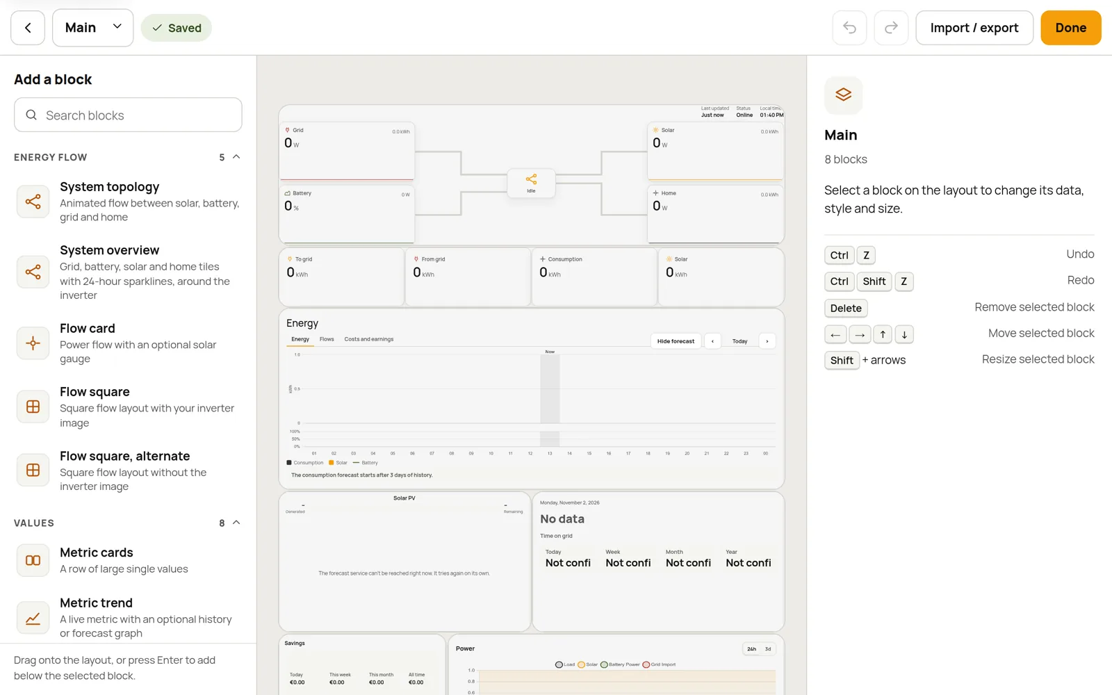
Add and arrange cards
- The block library is on the left. Search it, then drag a block onto the layout. Or select a card on the layout and press Enter on a library entry to drop the new one just below it.
- Move a card by dragging it, or select it and use the arrow keys. The layout is a grid, 12 columns wide unless you choose a finer one.
- Resize a card by dragging any edge or corner, or select it and press Shift + an arrow key.
- Duplicate a card with the copy icon in its toolbar, and press Delete to remove the selected card.
- Made a mistake? Undo with Ctrl + Z and redo with Ctrl + Shift + Z.
Card settings
Select a card to see its settings, which are split over three tabs:
| Tab | What it's for |
|---|---|
| Data | Which metrics the card shows. |
| Style | Colours, transparency, font size and the card's own display options. |
| Layout | How big it is on the grid. |
A card can also set its own Glass on the Style tab. Glass effect is Follow the dashboard (the default), On or Off, and Blur and Frost set how strong it is on this card. Anything you leave empty follows the dashboard's glass setting (see Dashboard style and Settings → Appearance), so one card can be frosted glass on a plain dashboard, or plain on a glass one. Glass looks best over a background picture.
You can use the same type of card as many times as you like, each with its own metrics. Most energy cards fall back on your metric roles when you don't pick metrics yourself.
Cards and the showcase describes every card in the library and what it needs.
Several dashboards
The dashboard menu at the top left lists all your dashboards. From there you can create a New dashboard, Rename… one, Duplicate it or Delete dashboard…, so you could have, say, an "Overview", a "Battery" view and a "TV display".
You choose which dashboard opens on computers and which on phones in Settings → Appearance.
The same menu also has the Controls page, which is where the switch, button, selector, slider and knob cards go; see Device controls.
Layout grid
By default a dashboard's layout is 12 columns wide, and cards snap to whole cells. For more exact placement, each dashboard can have its own grid.
Open the dashboard you want to change. With no card selected, Layout grid is at the top of the panel on the right. You can also choose Layout grid… from the dashboard menu.
Pick a Precision:
| Precision | Columns | Row height |
|---|---|---|
| Standard | 12 | 50 px |
| Fine | 24 | 25 px |
| Finer | 60 | 10 px |
Set the Space between cards, from 0 to 24 px (2 px by default).
Turn on Free placement to keep cards exactly where you drop them. Without it, cards move up to fill empty space. Turn on Allow overlap to let cards sit on top of each other, for example over a picture; this turns on free placement too. Where cards overlap, the one lower down the dashboard is on top.
Turn on Scale to screen width if the cards sit over a background picture and have to stay on the same part of it on every screen. See Scale to screen width below.
Changing the precision keeps every card where it is on the page. Going finer is exact. Going coarser moves a card to the nearest cell if it was not on one, and tells you how many moved; Undo puts them back. New cards, and cards you copy and paste from another dashboard, are sized to fit the grid.
Without free placement, the layout editor shows each card where it is saved, as the dashboard does. Cards that have empty space above them move up to fill it as soon as you move a card, so the editor tells you when that applies. Turn on Free placement to keep them where they are.
On a phone the cards stack in one column, whatever the grid. The grid is saved with the dashboard, so Export and Duplicate carry it along. The Controls page always uses the standard grid.
Scale to screen width
Normally a card's width follows the screen, but its height is a fixed number of pixels, and a background picture fills the browser window. On a screen of a different size the cards then sit on a different part of the picture. That is a problem when you place cards over something in the picture, such as the panels on a photo of your house.
With Scale to screen width on:
- The height of every row, and the space between cards, shrink and grow with the width of the dashboard, so the whole layout keeps its proportions. At 1400 px wide (the widest the dashboard gets) it is exactly the size you set; on a narrower screen it is smaller in the same proportion.
- The background picture sits behind the cards, as wide as they are, starting where they start. It is no longer stretched over the whole window, so a card stays on the same part of the picture. The layout editor draws it the same way, so what you place there is where it appears.
- On a phone the cards stack as they always do, and the picture fills the page background as before.
The picture is as wide as the cards, so on a very wide screen there is plain background on either side of it. Pick a background colour that matches the edge of your picture to make that unnoticeable.
The setting is off by default, so existing dashboards do not change. It is saved with the dashboard, and Export and Duplicate carry it along.
Dashboard style
Each dashboard can have its own look, so one can be a plain overview and another a glass-effect display over a photo.
Open the dashboard you want to change. With no card selected, the panel on the right shows Dashboard style. You can also choose Dashboard style… from the dashboard menu.
Change what you want: the background colour for light and for dark mode, a background image address (or No image on this dashboard), Transparent blocks, Square corners, and Glass cards with its blur and frost.
The layout behind the cards changes as you go, so you see the result straight away. It saves with the rest of your changes.
Anything you leave on Default follows Settings → Appearance, so changing those settings changes every dashboard that has not set its own. Use default puts one setting back, and Reset the style to the defaults puts them all back. The title, logo and favicon are the same on every dashboard.
A dashboard's style is saved with it, so Export and Duplicate carry it along. The Controls page has no dashboard style.
Import and export
Import / export in the toolbar lets you save your layouts or bring in someone else's:
- Export all dashboards downloads every dashboard's layout as a single JSON file.
- Import from file… reads such a file back in. Choose Append to add its dashboards to yours, or Replace to swap yours for them. If you change your mind, you can undo the import.
A layout file only contains the layouts, not your readings. For the cards to show anything, the metric names they use have to exist on the Epilykos you import them into.
Last updated on